- Details
- Written by: Stanko Milosev
- Category: CSS
- Hits: 5100
EM - Equal to the computed value of the font-size property of the element on which it is used.
HTML:
<!DOCTYPE html>
<html lang="en">
<head>
    <meta charset="UTF-8">
    <title></title>
</head>
<body>

    <div class="rootSquare"></div>

</body>

</html>
CSS:
.rootSquare {
	border: 1px solid #333;
	height: 1em;
}
Live example:
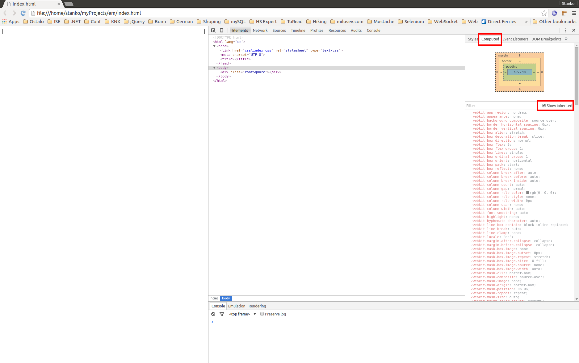
Notice in this my live example that "rootSquare" div is 14px - that is because parent element's font size is 14 pixels, so that means 1em = parent element font size, if font-size is not defined then default font size is taken
REM - same as the EM the only difference is that it will take font size of the root element which is usually HTML
- Details
- Written by: Stanko Milosev
- Category: CSS
- Hits: 5166
Here I mentioned "greater than" (or "bigger than") selector, but while I was reading SMACSS I realized that I don't understand some selectors good enough.
So, here are my examples taken from SMACSS.
Same HTML I am going to use, but with different CSS:
<!DOCTYPE html>
<html lang="en">
<head>
    <link rel="stylesheet" type="text/css" href="/css/index.css">
    <meta charset="UTF-8">
    <title></title>
</head>
<body>
    <div id="sidebar">
        I am a sidebar div
        <div>
            and I am inner div
            <div>
                and I am third level div
            </div>
        </div>
    </div>
</body>
</html>
1. With "greater than" selector:
CSS:
#sidebar>div {
    border: 1px solid #333;
}
Looks like this:
2. With space
CSS:
#sidebar div {
  border: 1px solid #333;
}
Looks like this:
- Details
- Written by: Stanko Milosev
- Category: CSS
- Hits: 11393
<!DOCTYPE html>
<html lang="en">
<head>
    <link rel="stylesheet" href="css/index.css" type="text/css">
    <meta charset="UTF-8">
    <title></title>
</head>
<body>

    <div class="mainContainer">
        <div class="subContainer">
            <div class="subSubContainer">
                <div class="someText">
                    some text
                </div>
            </div>
        </div>
    </div>

</body>
</html>
and this CSS:
.mainContainer {
    border: 1px solid rgb(0, 0, 0);
    width: 400px;
    height: 400px;
    position: relative;
    left: 100px;
    top: 100px;
}

.subContainer {
    border: 1px solid rgb(0, 0, 0);
    width: 200px;
    height: 200px;
    position: absolute;
    left: 100px;
    top: 100px;
}

.subSubContainer {
    border: 1px solid rgb(0, 0, 0);
    width: 100px;
    height: 100px;
    position: absolute;
    left: 50px;
    top: 50px;
}

.someText {
    left: 18px;
    top: 38px;
    position: absolute;
}
Live example:
Now we will convert just width and height of subContainer in css to percentage, and formula looks like:
width: calc(100 * 200% / 400);
height: calc(100 * 200% / 400);
Where 200% is 200px from subContainer, 400 is 400px from mainContainer and we multiply it with 100 in order to convert calculation to percentage.
The whole css would look something like:
html, body
{
    height: 100%;
}

.mainContainer {
    border: 1px solid rgb(0, 0, 0);
    width: calc(100*400%/1859);
    height: calc(100*400%/1089);
    position: relative;
    left: 100px;
    top: 100px;
}

.subContainer {
    border: 1px solid rgb(0, 0, 0);
    width: calc(100 * 200% / 400);
    height: calc(100 * 200% / 400);
    left: calc(100 * 100% / 400);
    top: calc(100 * 100% / 400);
    position: absolute;
}

.subSubContainer {
    border: 1px solid rgb(0, 0, 0);
    width: calc(100 * 100% / 200);
    height: calc(100 * 100% / 200);
    position: absolute;
    left: calc(100 * 50% / 200);
    top: calc(100 * 50% / 200);;
}

.someText {
    left: 18px;
    top: 38px;
    position: absolute;
}
Notice that I added:html, body { height: 100%; } and formula to calculate height looks like:
height: calc(100*400%/1089);
Because height of my view port is 1089.