- Details
- Written by: Stanko Milosev
- Category: CSS3
- Hits: 4966
Example of input type checkbox, and checked behaviour.
Lets say that we have code like this:
<input type="checkbox" class="myCheckbox" id="myOnoffswitch">

<label class="myOnoffswitch-label" for="myOnoffswitch">
  test
  <div class="myCircle"></div>
</label>
Then CSS looks like:
.myCircle {
    width: 10px;
    height: 10px;
    border: 1px solid #c0c0c0;
    border-radius: 50%;
}

.myCheckbox:checked + .myOnoffswitch-label .myCircle{
    color: red;
    border-color: red;
}
Here notice line:
.myCheckbox:checked + .myOnoffswitch-label .myCircle
with:
.myCheckbox:checked
we actualy said which CSS to apply when checkbox is checked, and plus sign means which CSS to follow.
Live example (click on check box to see small cirlce in red):
- Details
- Written by: Stanko Milosev
- Category: CSS3
- Hits: 4669
One quick example without too much explanation.
HTML:
<!DOCTYPE html>
<html lang="en">
<head>
    <meta charset="UTF-8">
    <link rel="stylesheet" type="text/css" href="/index.css">
    <title></title>
</head>
<body>
    <div id="parent">
        <div id="container">
            test
        </div>
    </div>
</body>
</html>
CSS:
#parent {
    margin: 0px auto 0px auto;
    width: 250px;
    overflow: hidden;
}

#container {
    position: relative;
    -webkit-animation-name: container;
    -webkit-animation-iteration-count: infinite;
    -webkit-animation-duration: 5s;
}

@-webkit-keyframes container {
    0% {
        -webkit-transform: translateX(0);
    }

    100% {
        -webkit-transform: translateX(800px);
    }
}
Live example (Chrome only):
test
- Details
- Written by: Stanko Milosev
- Category: CSS3
- Hits: 5066
HTML:
<!DOCTYPE html>
<html lang="en">
<head>
    <meta charset="UTF-8">
    <title></title>
    <link rel="stylesheet" type="text/css" href="/index.css">
</head>
<body>
    <button id="clickMe">Click Me</button>
</body>
</html>
CSS:
@-webkit-keyframes fadeIn {
    from {
        opacity:0;
    } to {
        opacity:1;
    }
}

#clickMe {
    opacity:0;  /* make things invisible upon start */
    -webkit-animation:fadeIn ease-in 1;  /* call our keyframe named fadeIn, use animattion ease-in and repeat it only 1 time */

    -webkit-animation-fill-mode:forwards;  /* this makes sure that after animation is done we remain at the last keyframe value (opacity: 1)*/

    -webkit-animation-duration:1s;

    -webkit-animation-delay: 0.7s;
}
Example:
- Details
- Written by: Stanko Milosev
- Category: CSS3
- Hits: 4814
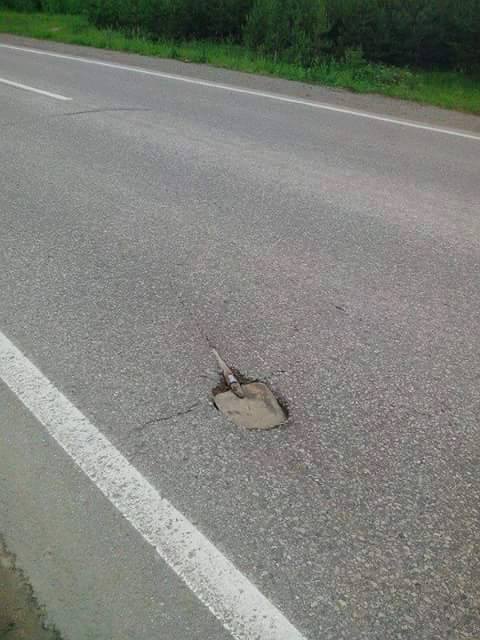
In my case I want to have image, and some text (in future that will be menu) which will swipe inside the image.
HTML:
<!DOCTYPE html>
<html>

	<head>
		<link type="text/css" rel="stylesheet" href="/index.css">
	</head>

	<body>
		<div id="images">
			<img id="myImage" src="/lopata.jpg"></img>
			<div id="myCssSwipe" class="myTranslateY">
				I will swipe
			</div>
		</div>

		<script type="text/javascript" src="/index.js"></script>

	</body>

</html>
JS:
document.getElementById("myImage").addEventListener("click", function() {
	if (document.getElementById("myCssSwipe").className !== "myTranslateY-clicked") {
		document.getElementById("myCssSwipe").className = "myTranslateY-clicked";
	} else {
		document.getElementById("myCssSwipe").className = "myTranslateY";
	}
})
CSS:
#images {
	position:relative;
	overflow: hidden;
	margin-top:100px
}

.myTranslateY {
	color: red;
	position:absolute;
    top:15%;

	-webkit-transition: all 5000ms ease;
	-webkit-transform: translateY(0px);
}

.myTranslateY-clicked {
	color: red;
	position:absolute;
    top:15%;

	-webkit-transform: translateY(-200px);
	-webkit-transition: all 5000ms ease;
}
Here notice line:margin-top:100px
which has no practical puropse, I just wanted to separate image from rest of HTML
Then notice:
overflow: hidden; Which I need for text to "disappear" when it comes to the end of the image.
Example (only in Chrome):
I will swipe